Google Drive Unveils Redesigned App for Tablets with Convenient Navigation Rail
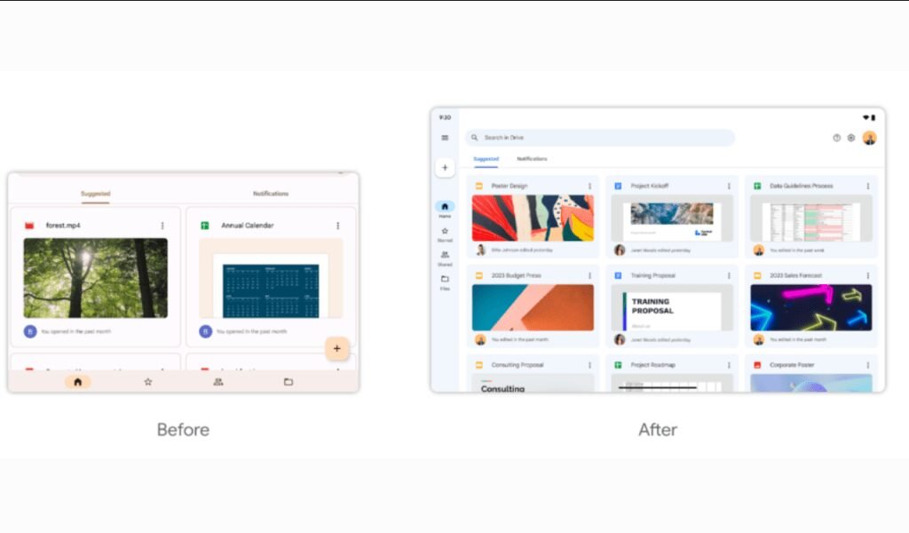
Google Drive has started rolling out a new tablet redesign that includes a navigation rail to make it easier to access files and folders. The redesign is part of Google’s effort to make its productivity apps more touch-friendly and optimized for tablet devices.
The new navigation rail is located on the left side of the screen and provides quick access to files and folders, as well as shortcuts to recent documents and files that have been starred. Users can also easily switch between different accounts or add new accounts directly from the navigation rail.
Google has been working on improving the usability of its productivity apps on mobile devices, including tablets, in recent years. The new Google Drive tablet redesign is part of this effort, and is aimed at making it easier for users to work on the go, whether they’re using a smartphone or a tablet.

According to Google, the new tablet redesign is currently rolling out to all Google Drive users on Android and iOS devices. However, it may take some time before all users receive the update.
In addition to the navigation rail and grid view, the new Google Drive tablet redesign also includes other touch-friendly features, such as larger touch targets and improved spacing between items. These changes should make it easier for users to interact with the app using their fingers, rather than a mouse or keyboard.
Overall, the new Google Drive tablet redesign is a welcome update for users who frequently work on the go using their tablets. It should make it easier to access and manage files, and should improve the overall user experience. If you’re a Google Drive user on a tablet, be sure to check for the update and give it a try once it’s available on your device.


