

In a bid to enhance user experience, Google Maps has rolled out a brand-new user interface (UI) design, complete with a fresh palette of updated colors. This exciting development has sparked widespread interest, especially in light of the ongoing comparison between Android and iOS, which extends to system apps like Google Maps.
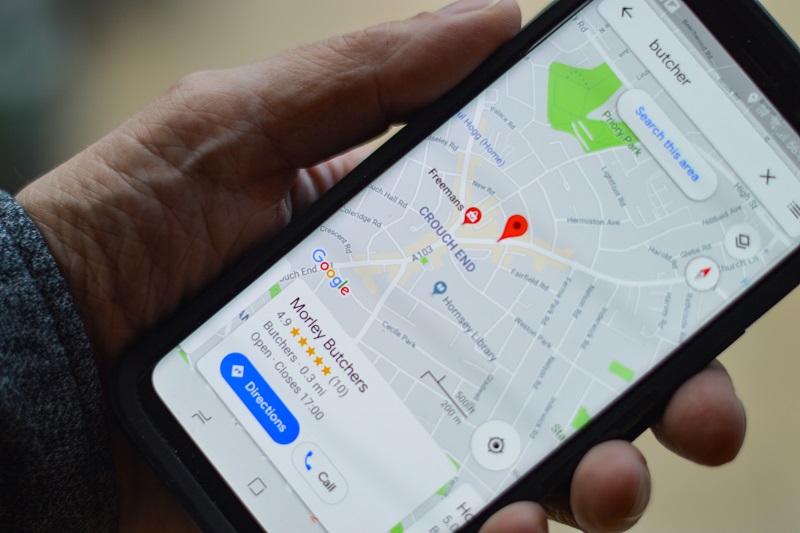
Google Maps New User Interface
Google Maps, a staple pre-installed application on most Android devices, has frequently found itself under the scrutiny of comparisons with rival mapping services like Apple Maps and Waze. With this latest UI overhaul, Google has ventured into territory more akin to Apple Maps, garnering a range of reactions from its user base.
One of the most notable changes in this redesigned UI is the revamped color scheme. City blocks, once sporting a range of colors, have now been transformed into a clean, uniform white, mirroring the aesthetics of Apple Maps. Streets have followed suit, adopting a subtle gray hue, aligning more closely with the look and feel of their iOS counterpart.
In a significant departure from its previous design, Google has reassigned the color yellow within the UI. It now indicates routes with moderate congestion, effectively replacing its former role of representing freeways. Additionally, the colors near water bodies and natural areas have received a makeover, with a calming teal blue denoting water features and a lush emerald green representing forests.


Perhaps one of the most noticeable changes is Google’s choice to veer away from its iconic bright green branding, opting instead for a more subdued green color scheme. This change is likely to resonate with users looking for a cleaner and more cohesive visual experience.
While the bottom bar in Google Maps has undergone a reduction in size, the Material You dynamic theming, a feature synonymous with Android customization, is conspicuously absent in this update.
It’s important to note that while these updates make Google Maps appear more reminiscent of Apple Maps, the web interface and the beloved dark mode remain unaltered. However, it’s worth mentioning that these changes may not be immediately visible to all users, suggesting that they might be part of a limited test or a gradual rollout.
In addition to these UI modifications, Google is also reportedly experimenting with redesigned pins for saved places. This hint at potential broader changes to the platform has left users intrigued about what Google Maps might have in store for them in the near future.
In conclusion, the recent facelift of Google Maps’ UI design marks a significant step towards aligning its aesthetics with Apple Maps. These changes promise a fresh and visually pleasing experience for users, even as the platform continues to explore further enhancements and refinements. Stay tuned for more updates on this evolving story.