Google Files App Receives a Material Design 3 Update
Google has recently updated its suite of apps to adapt to its new design language, Material You, which was released with Android 12. While many apps have already undergone this revamp, Google Files App was lagging behind. However, this is changing as Google Files App is now receiving more Material Design 3 love, including a refreshed home screen.
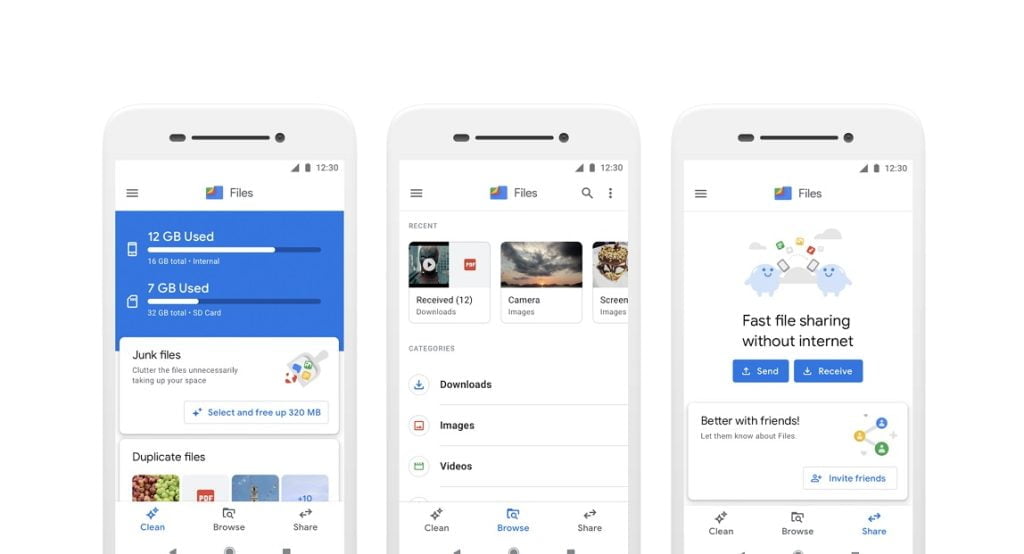
The new design is cleaner, more modern, and includes almost all UI elements that are now done in Material Design 3. There is also better support for Material You and dynamic theming. The search bar is now prominently displayed at the top across the app, regardless of the tab you are in.
The UI update does not include the new “Important” tab spotted in development a few months ago. Additionally, the feature description in the Nearby Share tab has been updated to highlight the various benefits of the peer-to-peer file sharing tool, including the ability to transfer data locally between devices without an active internet connection. However, no new tools or features have been added to the file manager, as the update solely focuses on the UI revamp.

The Material Design makeover of Files by Google is rolling out with v1.292.525444002, with a server-side update on top of that. The new interface is currently available on some devices, while others are still displaying the old interface. Once the update is rolled out, Files by Google, which is already one of Android’s best file management apps, will become even better.
The Need for Material Design 3 Update in Files by Google
With the release of Material You in Android 12, Google has updated its suite of apps to adapt to the new design language. However, Files by Google was still using the old design language. The recent update includes a Material Design 3 revamp, which has improved the overall look and feel of the app.
Revamped Home Screen
The new design of Files by Google has a cleaner and more modern look, with almost all UI elements now in Material Design 3. The home screen has undergone a significant revamp, and the search bar is now displayed prominently at the top across the app, irrespective of the tab you are in.
Cleaner and Modern UI
The UI of the app has been completely revamped to look cleaner and more modern. This includes the use of Material Design 3 and better support for Material You and dynamic theming. The new interface is a significant improvement from the old one and enhances the user experience.
Better Support for Material You and Dynamic Theming
The new design of Files by Google has better support for Material You and dynamic theming, making the app more personalized and customizable. The UI elements of the app dynamically change according to the system’s theme, which enhances the overall look and feel of the app.
Prominently Displayed Search Bar
The search bar is now displayed prominently at the top of the app, regardless of the tab you are in. This is a significant improvement from the old interface, where the search bar was buried under the “Browse” tab. The prominent display of the search bar makes it easier for users to search for files and folders.
With this update, Files by Google has become more modern and cleaner, with almost all UI elements now in Material Design 3, and better support for Material You and dynamic theming. The search bar is now prominently displayed at the top across the app, irrespective of the tab you are in. The Nearby Share tab also features an updated feature description that highlights the various benefits of the peer-to-peer file-sharing tool, including the ability to transfer data locally between devices without an active internet connection.


